Are you one of those who think that Climate Change is a Myth?
Please check these graphic images that depict the global temperature change from 1850 to 2019!!!
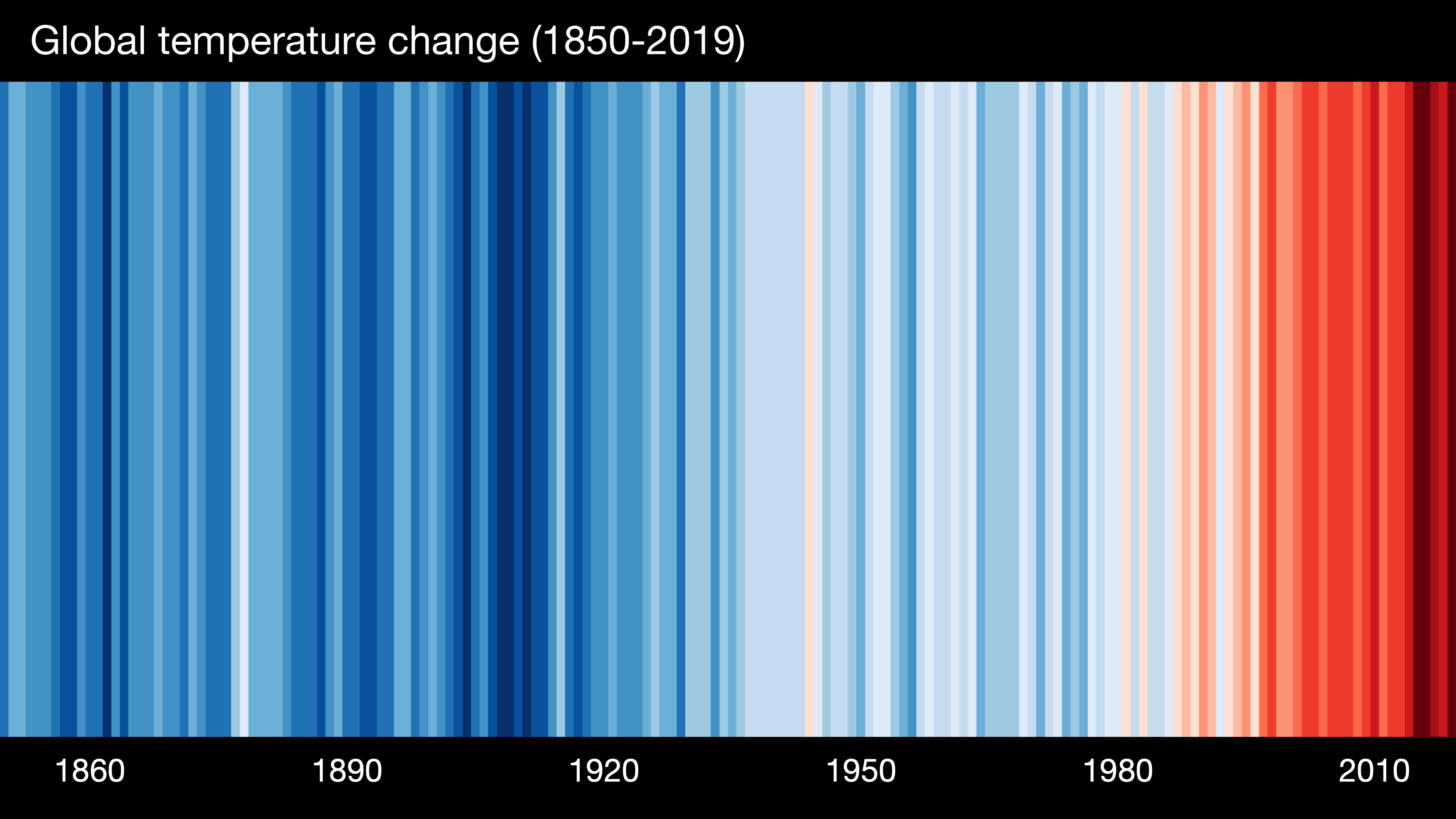
During our climate change study we came upon “Show yourt stripes” site by Professor Ed Hawkins (University of Reading) !
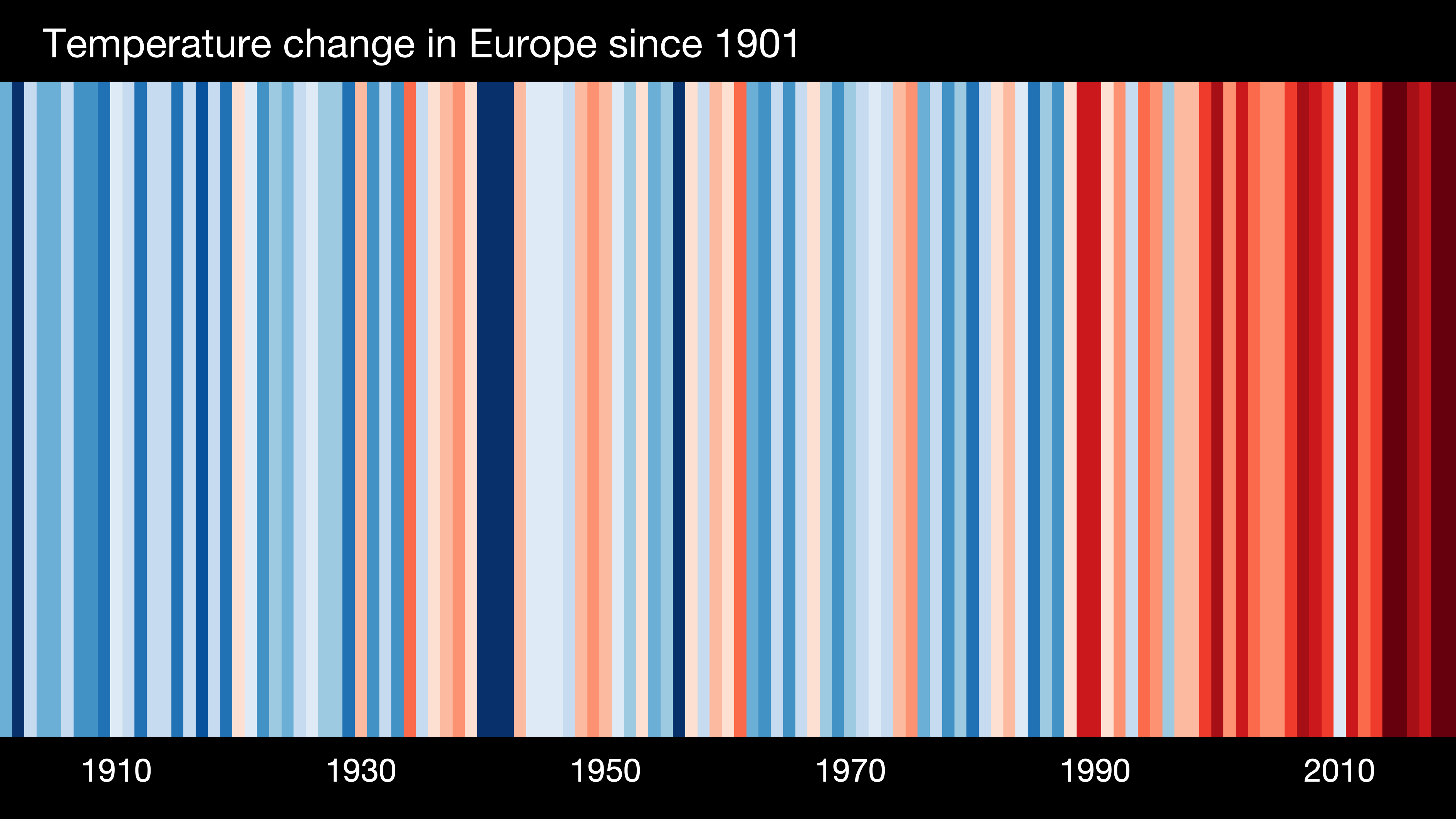
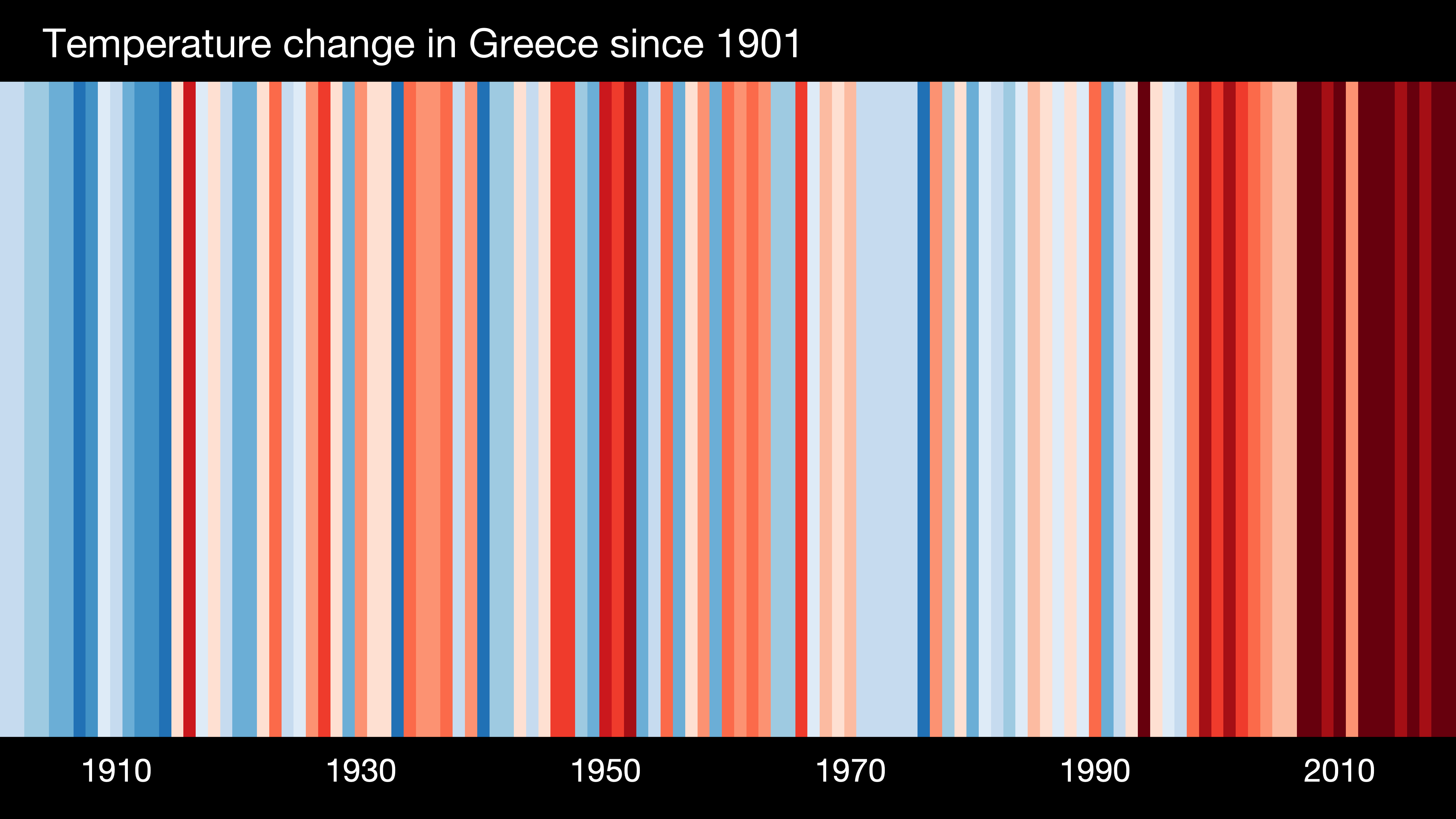
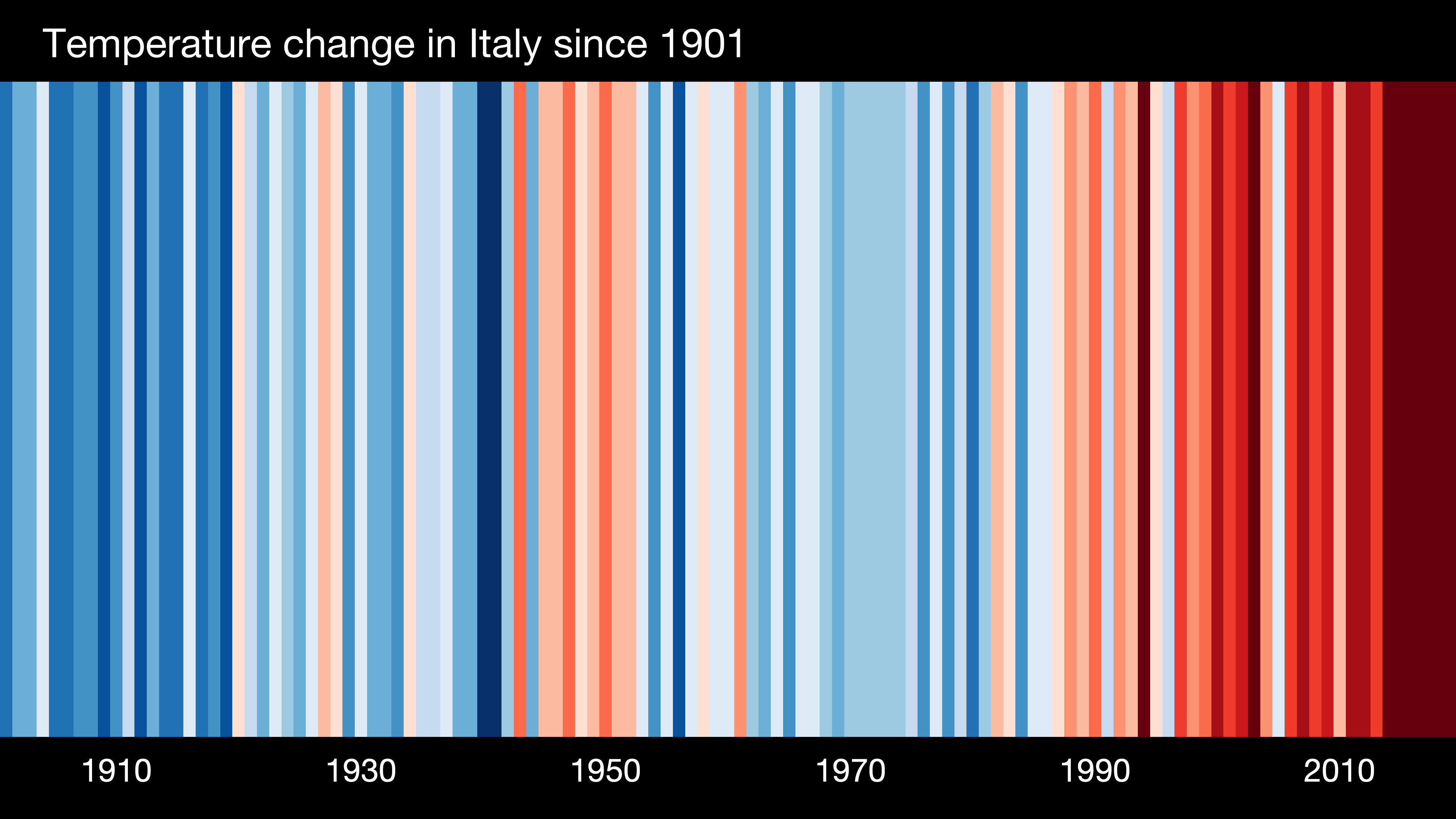
So useful and graphic that we could not resist depicting our country’s and our partner countries’ graphs of temperature change this past century. Check your country or region by visiting the site
The graphics have a CC-BY 4.0 license, so can be used for any purpose as long as credit is given to Professor Ed Hawkins (University of Reading) and a link is provided to this website.
Europe’s warming stripes since 1901
Greece’s warming stripes since 1901
Italy’s warming stripes since 1901
Germany’s warming stripes since 1901
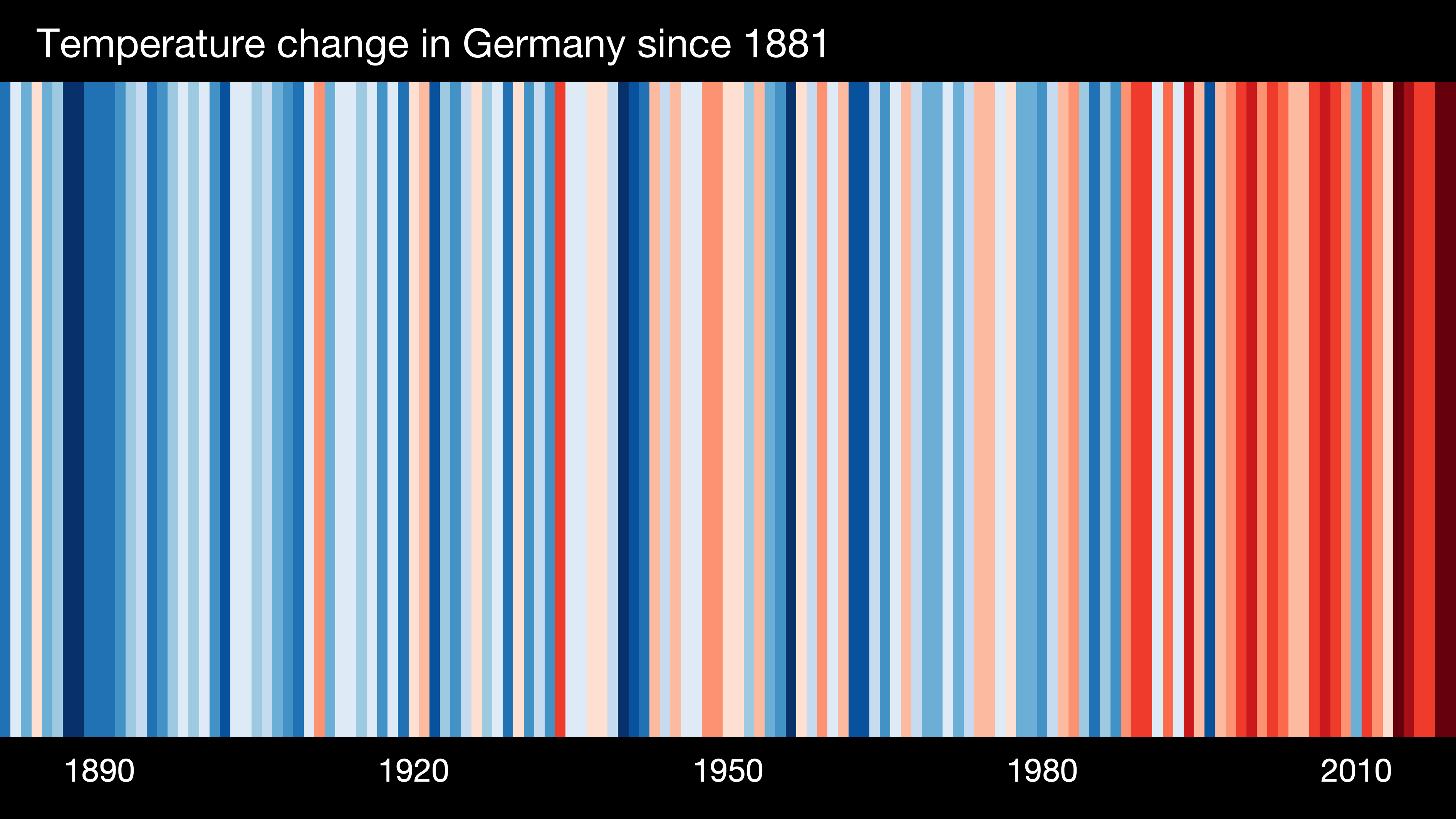
“These ‘warming stripe’ graphics are visual representations of the change in temperature as measured in each country over the past 100+ years. Each stripe represents the temperature in that country averaged over a year. For most countries, the stripes start in the year 1901 and finish in 2019. For the ocean basins and for several countries with longer datasets available the stripes start in the 19th century instead. For two cities (Stockholm and Vienna), the data starts in the 18th century.
For virtually every country or region, the stripes turn from mainly blue to mainly red in more recent years, illustrating the rise in average temperatures in that country.
These graphics are specifically designed to be as simple as possible, and to start conversations about our warming world and the risks of climate change. There are numerous sources of information which provide more specific details about how temperatures have changed, so these graphics fill a gap and enable communication with minimal scientific knowledge required to understand their meaning.
For most countries, the data comes from the Berkeley Earth temperature dataset, updated to the end of 2019. For some countries (USA, UK, Switzerland, Germany, France & Sweden) the data comes from the relevant national meteorological agency. For each country, the average temperature in 1971-2000 is set as the boundary between blue and red colours, and the colour scale varies from +/- 2.6 standard deviations of the annual average temperatures between 1901-2000. For the global average only, the UK Met Office HadCRUT4.6 dataset is used and the colour scale goes from -0.7°C to +0.7°C. The stripes are usually shown for the period 1901-2019 but this can be longer or slightly shorter depending on the location and whether the data is available & considered robust.
We are using present day country boundaries for the whole time period shown.”
Professor Ed Hawkins (University of Reading)


Recent Comments